Cost Analysis with Pareto Chart
Cost analysis is an essential process for any business. It uses structured methods to examine expenses and present them visually through a Preto chart. Displaying costs in a Pareto chart helps business owners quickly identify which expense categories account for the largest share of spending. Because it highlights major cost drivers at a glance, the Pareto chart is considered an effective tool for making cost evaluation simpler and more efficient.
Cost analysis is one of the most important activities for any organization. Many companies use a Pareto chart to perform this analysis effectively. A Pareto chart is particularly useful because it visually highlights the most significant cost drivers, the most frequent defects, and the most common problems, helping organizations focus on areas that need the most attention.
What is a Pareto chart?
A Pareto chart is a powerful tool used in cost analysis to identify the major expense categories that contribute most to overall costs. Every business owner aims to minimize expenses and maximize profits, but rising costs can significantly reduce profitability.
To manage expenses effectively, it is essential to understand which cost areas are driving the highest spending. A Pareto chart helps business owners visualize and prioritize the most significant cost factors, allowing them to focus on areas where cost reduction efforts will have the greatest impact. Therefore, learning how to create and use a Pareto chart is an important step in effective financial and operational decision-making.
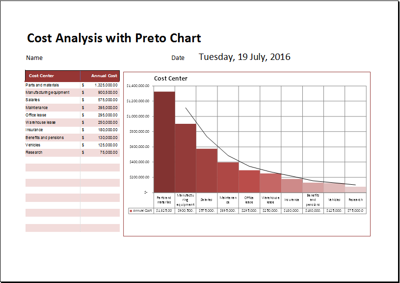
A Pareto chart is a specialized bar chart where cost values are arranged from highest to lowest. It also includes a superimposed line graph that represents the cumulative percentage of total costs. This line graph is plotted on a secondary vertical axis on the right side, ranging from 0% to 100%. By observing where the cumulative line reaches approximately 80%, users can easily identify the few cost items that contribute the most to the overall expenses.
A Cost Analysis with Pareto Chart template is provided in a spreadsheet format. The chart is generated automatically once you enter the required data and cost factors. This feature allows you to perform cost analysis quickly and identify the most significant causes or expense areas. Using a Pareto chart helps present cost analysis clearly and makes it easier to focus on the factors that have the greatest impact.
How to make the Pareto chart?
Various tools are available today to create Pareto charts for more effective cost analysis. Microsoft Excel is widely considered one of the best tools for developing Pareto charts due to its built-in features and flexibility. One of the main advantages of using a Pareto chart spreadsheet is that it can automatically perform calculations and organize data, making the analysis process faster and more efficient.
The spreadsheet should include different categories for proper cost or defect analysis. The first category should focus on business defects or issues, where the total number of defects can be clearly recorded. The spreadsheet should automatically calculate the percentage of each defect based on the overall total, enabling accurate analysis and easy creation of a Pareto chart.
The template
Users who want to avoid the hassle of creating a Pareto chart from scratch can download and use this ready-made template. The template is available in MS Excel format and includes pre-defined formulas, making it easy to analyze and monitor costs on a weekly or monthly basis.
You can organize and analyze your data easily using this Pareto chart template. It includes multiple built-in formulas that simplify calculations and automate many operations. With these predefined formulas, you can efficiently perform all cost analysis tasks without manual effort.
Download your file below.
Cost Analysis with Pareto Chart Template
File Size: 47 KB
- Children’s Daily Activity Reward Sheet
- Winter Clothing & Gear Budget Sheet
- Winter Utility Expense Template
- Fuel & Equipment Sheets
- Monthly Attendance Sheet for Employees
- Student Entry & Exit Log
- Gantt Chart for Smaller Projects
- Behavior Log of Child for Schools
- Loan Repayment Tracker
- Product Sales Tracker Template
- Debit Memo Template for Excel
- Winter Attire Inventory
- Financial Projections Worksheet
- Employee Absence Tracker
- Weekly Sales Report Template
← Previous Article
Strategy Canvas TemplateNext Article →
Small Business Cash Flow Analysis Worksheet