Cost Analysis with Pareto Chart
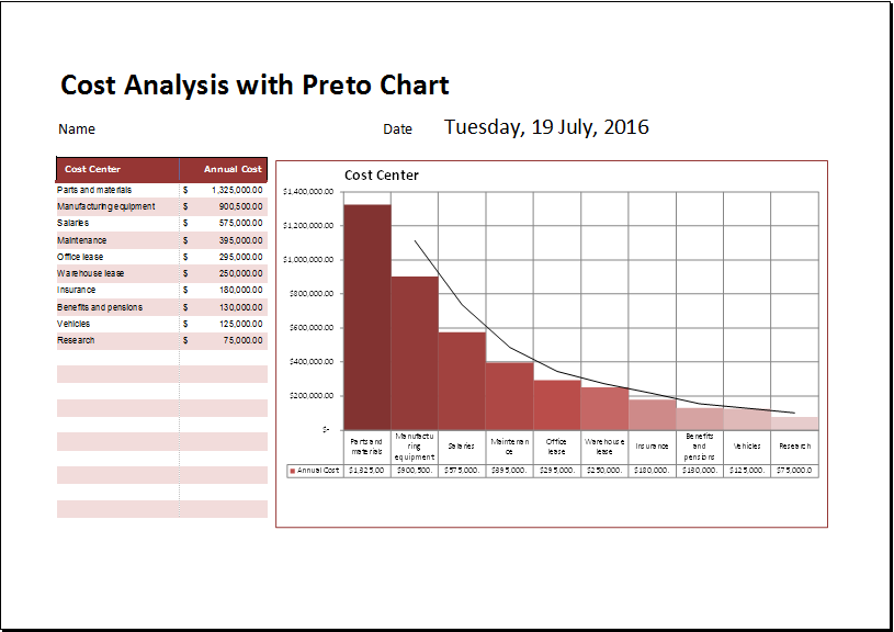
Analyzing the cost is, no doubt, the basic need of a business. The cost analysis template uses many techniques that enable a businessman to analyze the cost of the business and display it in the form of a Pareto chart. The purpose of displaying the cost through a Pareto chart is to help the businessman assess where most of the earnings of a business are being spent. The Pareto chart is considered an effective tool since it makes the assessment easier and more efficient.
The cost analysis can be the most important part of the company. Many companies carry out this analysis with the help of a Pareto chart. The Pareto chart is very useful when the business is required to have quality control. This chart is used as part of the Pareto chart analysis to identify the most important factors visually, the most occurring defects, and the most common problems.
What is a Pareto chart?
A Pareto chart is a tool that helps a person know the common problems occurring in a business and their causes. Every businessman desires to minimize the cost of the business and maximize the profit. Sometimes, the cost of the business goes too up, and the profit made by the business reduces to a great extent. It becomes crucial for a businessman to figure out why is the cost too high. Therefore, a businessman must always know how to create a Pareto chart.
The Pareto chart is a bar chart with a unique type in which the values are placed in the order of largest to smallest. The Pareto chart is also a superimposed line graph that represents the cumulative total. The secondary axis (the axis on the right side) with values of 0% to 100% is used on the line graph. The person is just required to observe the line graph when it crosses 80% of the line.
The cost analysis with the Pareto chart template is available in a spreadsheet. This spreadsheet makes the graph automatically when you enter the factors in it. This can be very helpful when you want to perform the cost analysis quickly to identify the significant causes, problems, etc. The cost analysis is carried out in the best way with the help of a Pareto chart.
How to make the Pareto chart?
Numerous tools are being used nowadays to make the Pareto chart for conducting the cost analysis in a better way. MS Excel is considered the best tool for making the Pareto chart. The benefit of using the Pareto chart spreadsheet is that it performs many operations by itself.
There are different categories that you need to include in the spreadsheet. The first category should be based on the defects of the business. In this category, you can easily specify the total number of defects. The spreadsheet should be able to calculate the percentage of defects with the help of the total number of defects mentioned in it.
Pareto chart template:
People who want to save themselves from the hassle of creating the Pareto chart from scratch can either download the template or use it online. The template is available in MS Excel format and contains many pre-defined formulas which make it too easy for the user to analyze the cost that it is incurring each month or week.
You can sort out the date very easily with the help of this Pareto chart template. There have been used many formulas which make many operations very easy. You can perform all the operations with the help of predefined formulas used in this template.
Download your file below.
Cost Analysis with Pareto Chart Template
File Size: 47 KB
- Budget Vs Actual Statement
- Remote Work Attendance Tracker
- Mileage Expense Report Template
- Fitness Calendar Template
- Project Gantt Chart
- Daily Attendance Tracker for an Individual Employee
- Overtime Hours Tracker Template
- Vacation and Leave Tracker Template
- Departmental Expense Report Template
- Event Planning Gantt Chart
- Employee Attendance Dashboard
- Monthly Study Reminder & Planner
- Move-in Checklist Template
- Camping Checklist Template
- Employee Orientation Checklist Template
← Previous Article
Strategy Canvas TemplateNext Article →
Refund Claim Record Form
