Gantt Chart Template
Scheduling is a crucial process for individuals who face time constraints and manage heavy workloads. Planning and organizing tasks becomes especially vital when multiple projects are assigned. Often, the challenge lies in handling several tasks simultaneously, which can become overwhelming without proper management tools. To overcome this, Gantt charts are widely used around the world.
If you work in project management, you likely understand the value of a Gantt chart. It serves as an effective production control tool and proves highly beneficial in organizing and tracking the progress of various projects.
Understanding the Gantt Chart: A Project Management Tool
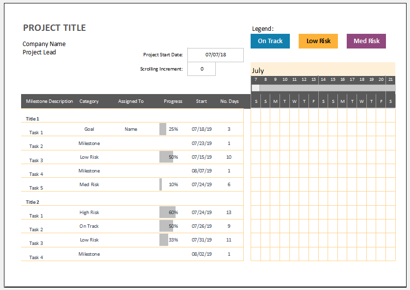
A Gantt chart is a visual tool that uses a series of horizontal bars to represent the progress of work or production over specific periods. It compares the actual progress against what was initially planned, helping teams determine whether they are meeting their targets.
Widely used in project management, a Gantt chart displays the scheduling of tasks and timelines. It also assists individuals and teams in managing their time more effectively, especially when handling multiple responsibilities.
Effective Project Planning with Gantt Charts
A Gantt chart is a visual project management tool that provides a clear overview of various components of a project. It helps project managers effectively organize and monitor the entire workflow. With a Gantt chart, one can easily view the full project timeline, see how the project is broken down into manageable tasks, and track the start and end dates of each task segment.
When life gets busy and juggling multiple project-related tasks becomes overwhelming, Gantt charts serve as a valuable resource. They assist in managing time efficiently, reducing stress, and ensuring that tasks are completed in an organized and timely manner.
Why Gantt Charts are Becoming Increasingly Popular
Gantt charts are being used more frequently nowadays because they simplify project management significantly. Users can easily view not only the list of tasks to be completed but also the relationships and dependencies between those tasks. This comprehensive view helps them manage projects more effectively and stay on schedule.
Below are some of the key reasons why Gantt charts have gained widespread popularity:
They are used for planning project activities:
No task can be executed professionally and efficiently without proper planning. Planning is the most crucial part of the initial phase of any project, as it provides structure and direction. When individuals follow a well-thought-out plan, it helps them stay organized and focused. Projects are more likely to be completed on time when plans are clearly defined and consistently followed.
They help in the easy tracking of tasks:
When multiple tasks need to be completed, it can be challenging to keep track of everything. Without effective tracking, it becomes difficult to determine whether tasks are progressing smoothly or if there are any dependencies or obstacles affecting their completion.
Understanding Task Dependencies through Chats
As mentioned earlier, the chart is used to identify the dependencies between various activities. This helps individuals determine which tasks should be executed first. When dependencies are clearly defined and the priority order is understood, tasks can be completed efficiently without any delays or interruptions.
Real-Time Project Status Visibility
Project managers can monitor the progress of a project at any time. They can also view its current status. For example, a Gantt chart indicates whether the project is in the planning phase, under execution, or undergoing review for accuracy and quality.
How to Create a Gantt Chart in Microsoft Excel?
If you need to create a Gantt chart template in Excel, consider the following steps:
- Microsoft Excel and Gantt Charts: Microsoft Excel includes a built-in Gantt chart template. However, you can manually create one by using the stacked bar chart feature combined with custom formatting.
- Build a Project Table: Start by entering your project data into an Excel spreadsheet. List each task on a separate row. Include columns for: Start Date, End Date, Duration. This forms the basis for your project plan.
- Insert a Stacked Bart Chart: Create a standard bar chart based on your project’s Start Dates:
1. Select the Start Date column (including the header).
2. Go to Insert > Charts group and click Bar.
3. Under the 2-D Bar section, select Stacked Bar. - Add Duration Data to the Chart:
1. Right-click on the chart and select “Select Data”
2. Click the Add button to include the Duration data.
3. In the Edit Series window, type “Duration” as the Series Name.
4. Click the range icon and select the Duration column from your table.
5. Click OK to apply. - Add Task Description: Replace the vertical axis labels (usually showing days) with your task names. This ensures each bar in the Gantt chart corresponds to a specific task.
- Format the Chart as a Gantt Chart: Now, convert your bar chart into a proper Gantt chart by formatting:
1. Make the Start Date bars transparent (don’t delete them).
2. Make the Duration bars (typically in orange) remain visible to represent tasks. - Enhance the Design: Improve your Gantt chart’s appearance by:
1. Removing unnecessary space on the left.
2. Adjusting the number of visible date intervals.
3. Reducing excess white space between the bars for a cleaner layout.
With these steps, you can successfully design a customized and professional-looking Gantt chart using Microsoft Excel.
Advantages of a Gantt Chart Template:
- It helps you determine whether you have achieved your production targets.
- It also provides a visual representation to show whether the work is progressing according to plan.
Why You Should Start Using Gantt Charts?
Nowadays, most people are using Gantt charts to manage their tasks and projects effectively. If you don’t want to fall behind, consider starting to use them too, just like others aiming to stand out with their fast progress.
You can easily create a Gantt chart in Microsoft Excel by following the steps mentioned above and incorporating additional details as needed. Be sure to enter information carefully to avoid errors. You can also enhance the chart’s appearance by using different colors for better visualization.
Template
Preview
Format: MS Excel (.xlsx)
File Size: 90 KB
- Children’s Daily Activity Reward Sheet
- Winter Clothing & Gear Budget Sheet
- Winter Utility Expense Template
- Fuel & Equipment Sheets
- Monthly Attendance Sheet for Employees
- Student Entry & Exit Log
- Gantt Chart for Smaller Projects
- Behavior Log of Child for Schools
- Loan Repayment Tracker
- Product Sales Tracker Template
- Debit Memo Template for Excel
- Winter Attire Inventory
- Financial Projections Worksheet
- Employee Absence Tracker
- Weekly Sales Report Template
← Previous Article
Personal Mileage TrackerNext Article →
Price Quotations